B2B Quarterly Sales Tool
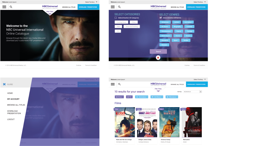
NBCUniversal, a global leading media and entertainment company, faced challenges with a complex tool for distributing information about their title releases worldwide.
Defining Problem
My approach began with gaining a comprehensive understanding of the product, its user flows, and user goals. We then conducted a thorough analysis of the product to ascertain the following:
1. Identification of areas where the old version of the product either supports or hinders users in achieving their goals.
2. Evaluation of UI elements that deviate from best practices and may potentially cause user frustration.
3. Assessment of the nature of title releases on different regions, and its intricate details regarding dates, marketing spend, featured releases, access permissions, etc.
4. Examination of the simplicity, clarity, and effectiveness of the user flow.
The analysis result
Following the discovery phase, we established the following primary goals:
1. Redesign the website to enhance User Experience (UX) and ensure alignment with the Chakra UI framework used in other NBCUniversal products.
2. Simplify the workflow for users operating across multiple territories, thereby streamlining their experience with the tool.
The design process
Weekly meetings with the client played a crucial role right from the outset. Since the final users, marketing leaders from various regions, were challenging to reach directly, our client served as a vital conduit, conveying their concerns, needs, and priorities while navigating the site. Through these meetings, we delved into the desired outcomes users sought on the site and how the interface accommodated users working across different territories simultaneously. Based on insights gathered from these discussions, we developed the initial low-fidelity wireframes.
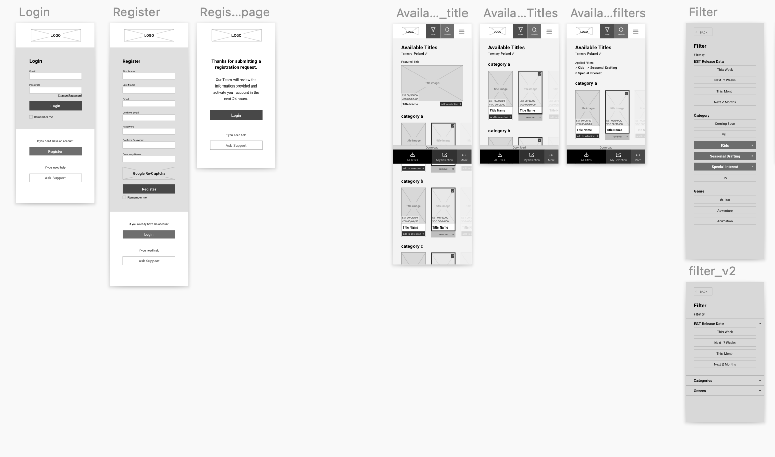
HIGH FIDELITY WIREFRAMES
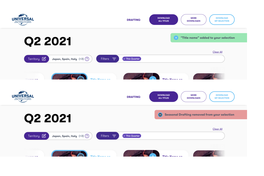
Once the low-fidelity wireframes received approval, I proceeded to develop the high-fidelity wireframes. In these designs, I incorporated a filter bar to assist users in navigating through the various territories accessible to them and applying different search criteria based on their interests. The chosen filter criteria remained visible to the user at all times, enhancing usability. Additionally, I included a "Clear all" button for each area to ensure ease of use across multiple interactions.
My role included reviewing the initial Statement of Work, exploring new user needs and providing innovative solutions, discussing new requirements with the NBC team, helping PM to define scope and work effort, and instructing NBC on how the backend platform work.
We improved the My Selection feature with clear buttons for easy modification of selections. Users receive feedback when titles are added or removed, ensuring they can review and modify their list effortlessly throughout their journey, enhancing the user experience.
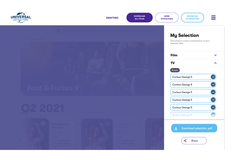
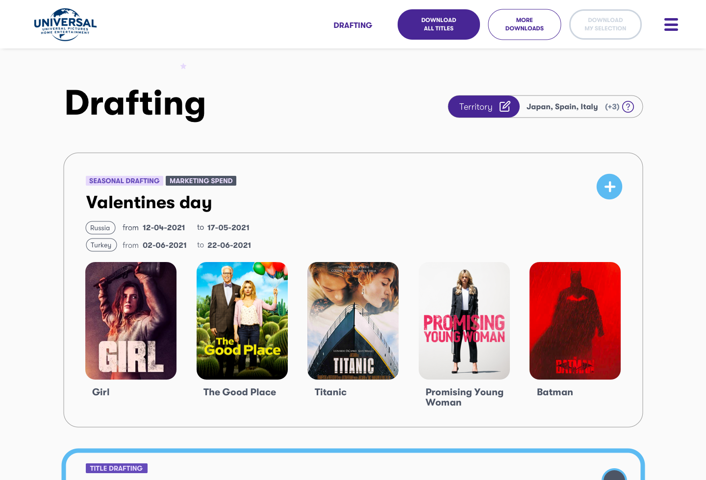
As mentioned above, the drafting page was a new addition to the site, requiring inclusion of two types of draftings with an option to indicate marketing expenditure. I utilized tags to convey this information on the page. Additionally, draftings were integrated into My Selection using the same selection method as titles, minimizing the learning curve for users.
The drafting page was one of the new sections in the site, we had two discovery meetings for this new part of the site.
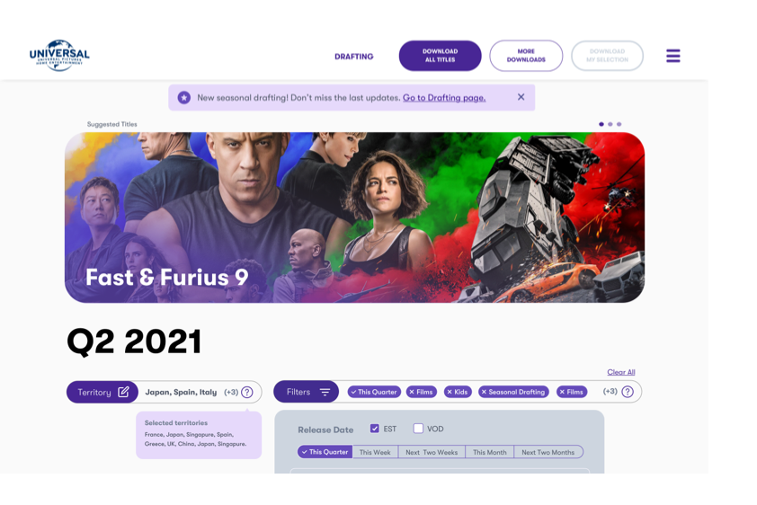
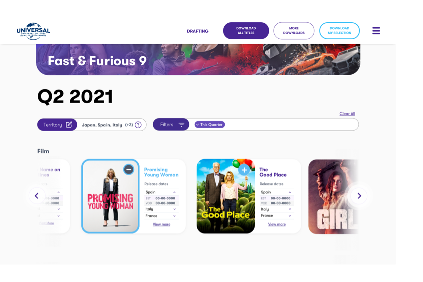
Product Launch 🚀
The launch marked a significant turning point for the NBCUniversal team. Prior to our collaboration, the product experience was fragmented and outdated, making it challenging for internal teams to manage and distribute media efficiently. Following the launch, users now benefit from a modern, intuitive platform that streamlines workflows and enhances overall productivity. We’re monitoring user feedback to gauge the impact of the redesign. Early indicators show increased engagement and positive responses from key stakeholders. Looking ahead, we’ll continue gathering insights from real-world use and supporting the client.
If you liked this project and would like to know more or have a chat about, contact me on LinkedIn.