Transforming Grocery Shopping into a Lifestyle Experience
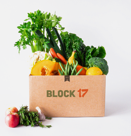
Block17 is a farm that specializes in the commercialization of certified organic products. They offer customized boxes filled with seasonal produce, carefully curated to accommodate each customer's dietary preferences. Each week, customers receive a box of food delivered right to their doorstep for ultimate convenience.
Starting by research
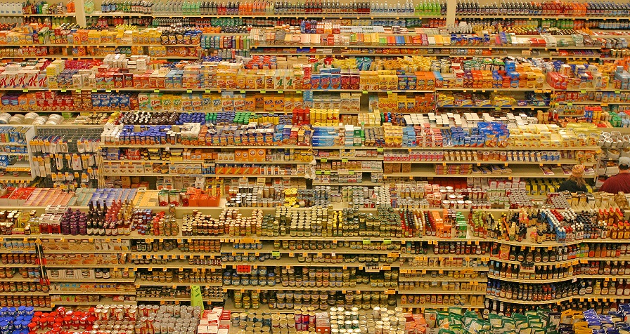
Traditionally, people have purchased their groceries from malls, supermarket chains, and grocery stores. However, in these conventional settings, individuals often face the challenge of navigating through aisles filled with various products, with healthy options sometimes obscured by shelves stacked with cookies and TV dinners. While supermarket shelves may boast labels such as 'low calorie', 'low sugar', 'low fat', and 'low sodium', these claims do not necessarily reflect the true nutritional value of the products. In fact, they may inadvertently mislead consumers into believing that the items are healthier than they actually are.
Understanding customers
After consulting with the client, I identified several target demographics, including vegans, vegetarians, moms, families, and health-conscious individuals. Armed with this insight, I delved into social media groups and pages to gain a deeper understanding of their purchasing behaviors. Through this process, I was able to observe how, when, where, and why they currently purchase products similar to those offered by our client. Additionally, I sought to uncover the reasons behind their reluctance to make online purchases.
For this part, I used "Do people need my product?" a worksheet to find the right people on social media, created by Tomer Sharon.
Through my research, I discovered that many individuals continue to opt for in-person shopping due to several common issues encountered with grocery delivery services.These challenges include items frequently being out of stock (54%), difficulty scheduling deliveries (34%), high service fees (23%), late deliveries (21%), compromised quality or freshness of food (17%), and instances of deliveries being canceled or never arriving (16%).
I conducted a survey to gather this valuable information. You can find it HERE
I also conducted an investigation into the areas of improvement desired by consumers in the markets where they typically shop. Among the topics mentioned were: certified organic food options, ethical work environments, affordability, accessible nutritional information, quick and easy recipes, appealing healthy options for children, and a variety of nutritious snacks.
I created a list of ‘How Might We…’ questions to help us better align our user’s tasks and goals.
THE DESIGN PROCESS
I used the card sorting technique to determine which functionalities should I include or eliminated based on the platform’s request made by the client and how much value it was adding on the future product.
This was cool to open the possibilities and have a wide view of the project.
Internal Feedback
I sent out a brief survey to our client to gather insights on what enhancements should be incorporated into our e-commerce platform, addressing real customer demands they've encountered. The aim was to identify potential quick wins by pinpointing simple improvements that could be swiftly implemented.
Tom was always open to colaborate with the project althought he was always in a rush.
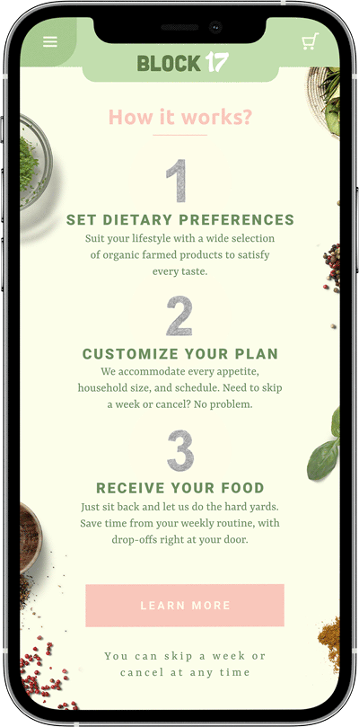
Among the feedback received, one notable suggestion was the implementation of a feature to calculate box size based on the number of household members. Additionally, respondents emphasized the importance of clearly communicating the option to skip a week or cancel at any time for weekly orders, and proposed integrating this functionality as a prominent feature on the platform.
People never want a long commintment!
MAIN OBJECTIVE
We determined that our main objective is to create an enjoyable and affordable experience of buying with clear information and customizable plans for every need, where people feels encourage to go ahead and take the next step. A transparent interface was important in order to relieve pain points that buyers encounter, especially around their journey in the supermarket.
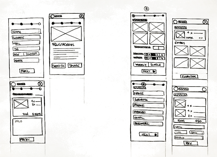
ITERATE, ITERATE AND ITERATE
Based on my findings shown above, I narrowed my focus into 3 areas:
Work on delivery settings
Include different and customizable plans
Always prioritize a simple and enjoyable process
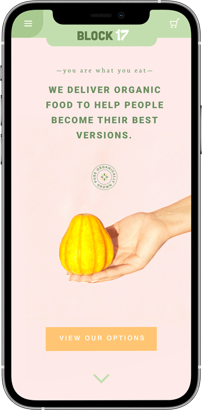
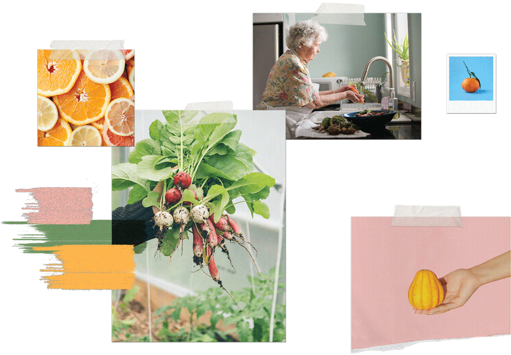
The landing page is meant to explain how simple is buying at Block 17 and why it is a better experience than the supermarkets. I used pastel colors to create a calming and enjoyable effect, something missed in the regular supermarket experience. As well these colors evoke something retro, bringing back that freshness that little markets used to bring to our grandmother's house.
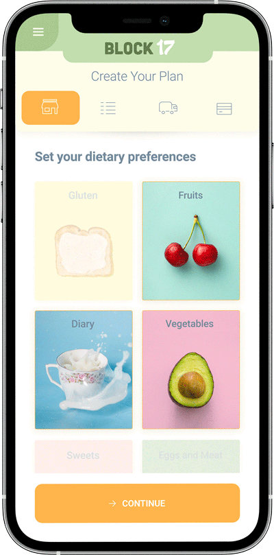
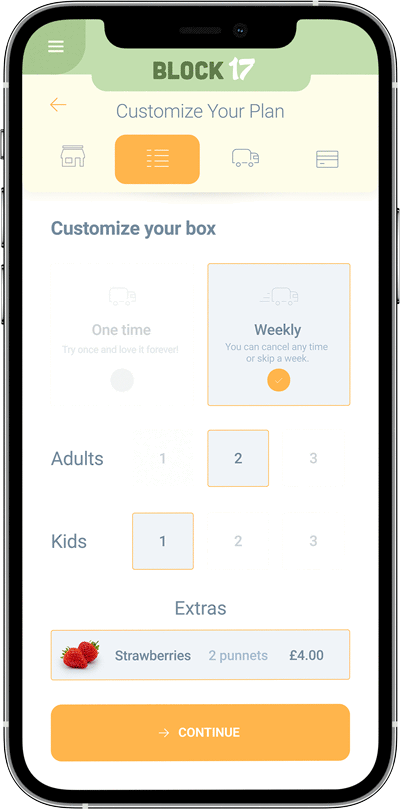
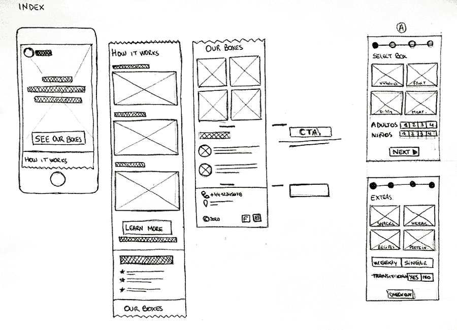
In the first step the user would just set his diet preferences. I wanted to create a very easy first step to enroll user on the four steps' user flow. After it, he would select how big is the box, how frecuently he wants to receive it and we will use the opportunity to sell the extra stuff the company have at the moment, to avoid waste.
 I was inspired by old hadwritting lists.
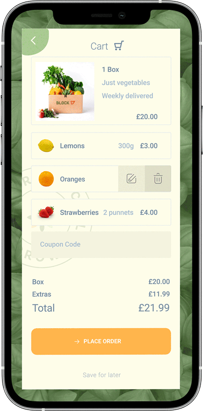
I used a modal to show the cart. As it is an step that it is supposed to requiere just a quick check before pressing the Next button, I avoided creating another step in the user flow to keep it short. This was also a great way to add some fun to the flow.
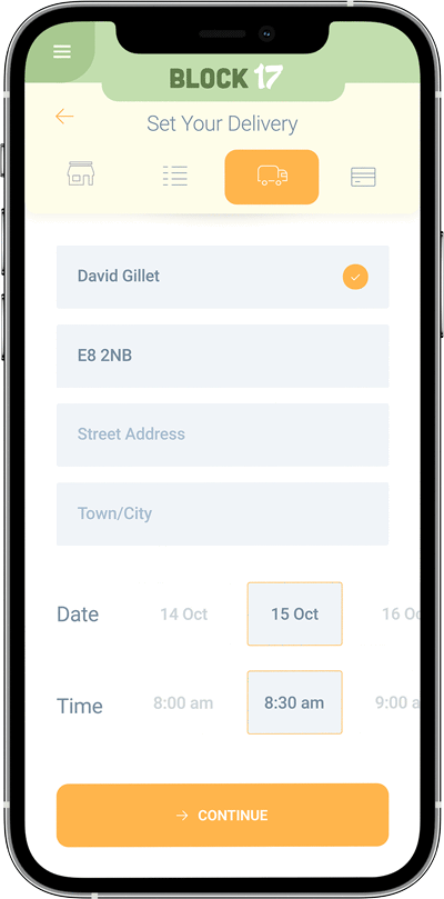
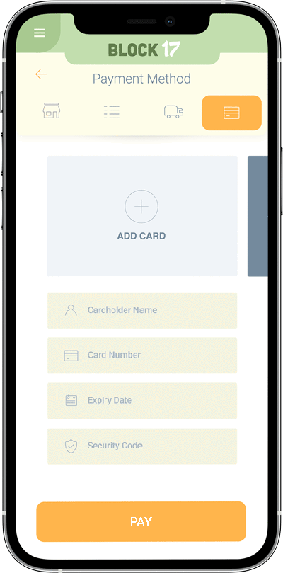
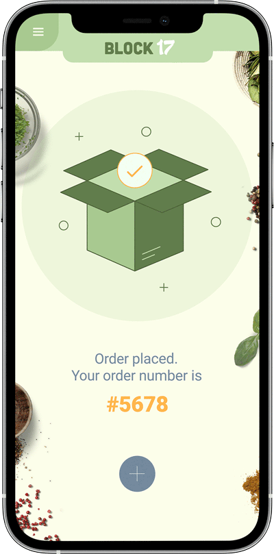
This two screens are the ones that requiere more from the user: his address, full name, credit card, etc. I wanted to keep this part at the end, when user has already done the first steps, liked the product and decided he wants the box. At this point user wants to finish. The possibilities that the user close and leaves the app at this point are lower than before. He have done some work already. He already wants to see the confirmation message.