DROPMETRICS
Helping retailers to improve sales productivity
DropMetrics provides support for retailers, mainly in the electronics industry. The application collects data from tracking profits, shipping costs, and fees and builds the necessary charts and diagrams to display this information in a user-friendly and digestible way. The main goal of DropMetrics is allowing a retailer to make informed and effective decisions, simplifying operational processes.
STARTING WITH QUESTIONS
I created a list of ‘How Might We…’ questions to help us better align our user’s tasks and goals.
Research/Strategy
I was able to identify some issues that not many people had a solution for:
The first idea that immediately came from people who was already using any financial application was "Unclear and overwhelming data presentation and complex calculations".
1. A large majority of people were using excel for tracking selling inventory and monitor the status of the products. This means boring tables.
2. People were using spreadsheets and applications to help them manage their finances, but for a large majority of them meant to be a loss of time because they did not know what to do with that information.
3. People struggled to track expenses.
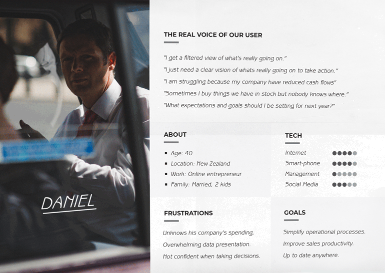
4. A large majority of people did not feel confident with the information they manage when it came to take radical decisions.
First attemps
After the research was done, I started thinking how to organize the most useful stats. Creating a data visualization system was a challenge for me as it had to consist of many statistics and graphics blocks. I created a hamburger button in the top-left side and a swipe left navigation in each section to reduce the time on task. They can easily find where they need to go while having key information on the dashboard for them to digest.
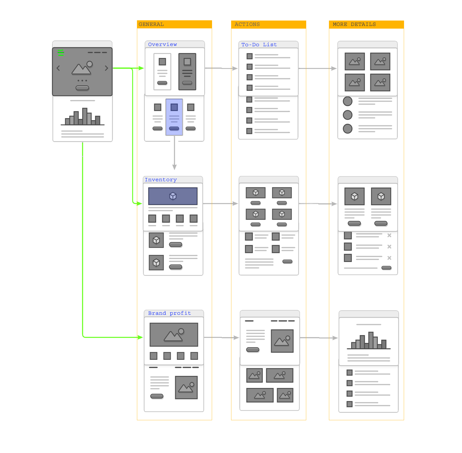
Understanding how to organize the information was a double challenge. First because the amount of information I needed to manage in small divices. Second because each data needs a different chart to make sense. I had to make sure I understand what was important for the user in terms of how to show and compare data.
Research was crucial for me to create statistic blocks that solved users’ needs. At this point I had to ask myself which data was useful for the user. And yhis was the result:
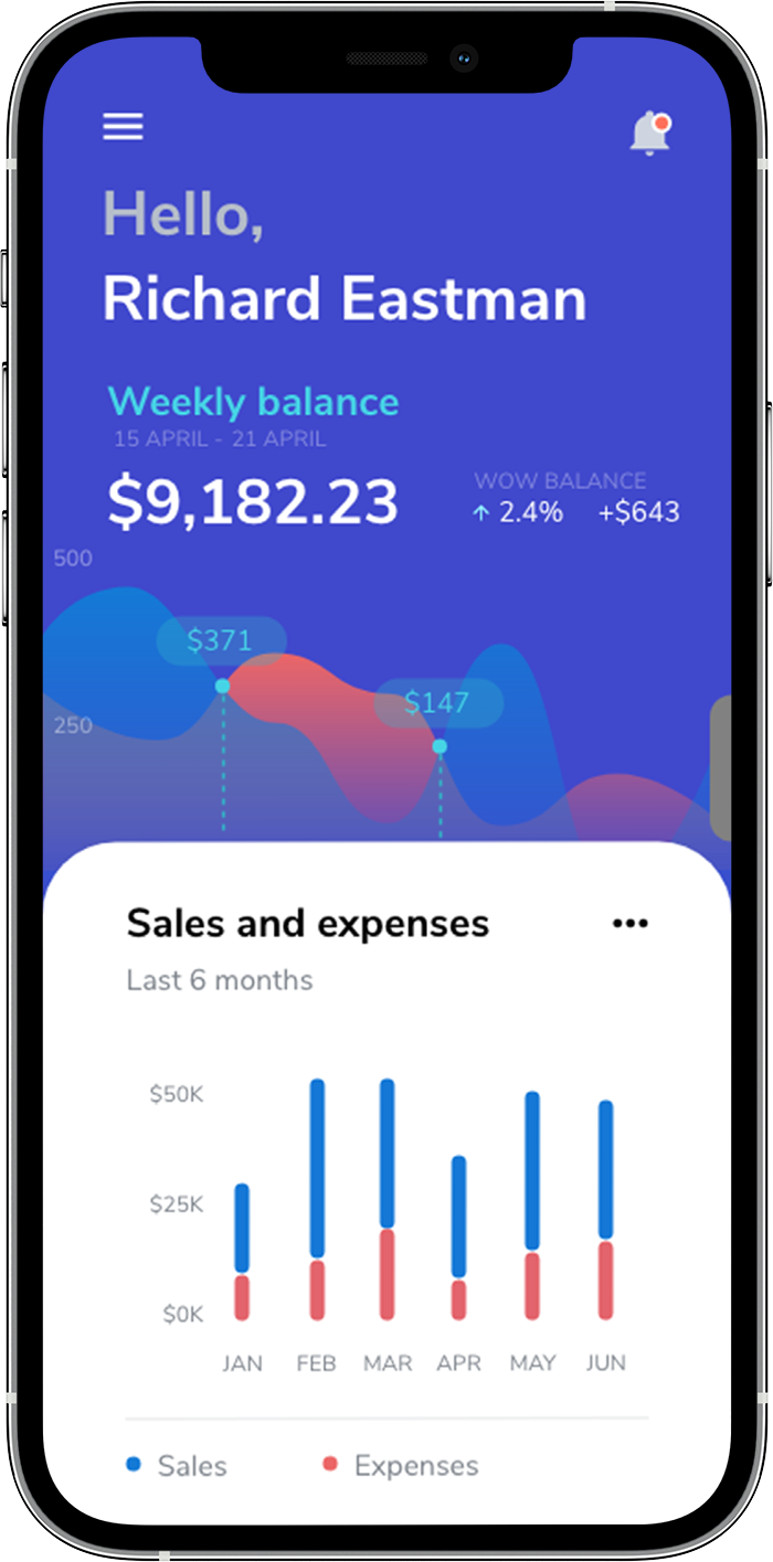
Inventory: the total quantity of items that the retailer has and the state of them.
Average Sales: average income and profit that the retailer make over a certain period of time.
Sales and Expenses: any costs incurred by the retailer and the number of goods sold.
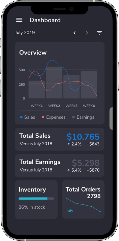
Overview: general information about sales, orders, and profits for a selected period of time (year, month or week).
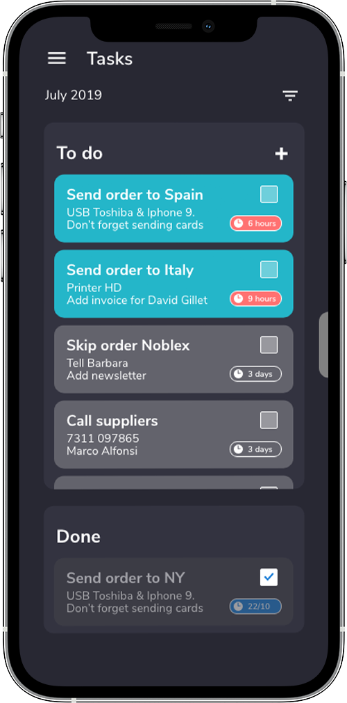
A to-do list: added to the dashboard to give the user instant, easy and practical information.
I used adobe XD for this project.
The To-Do list highlights the upcoming tasks that need to be done in the day.
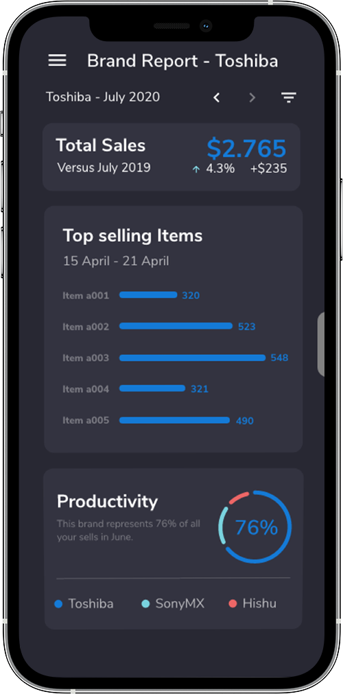
The brand report layout shows monthly information and compares to others brands and periods. This was mainly orientated to make people feel confident with the information they manage when it came to take radical decisions.